
User Tools
 de
de en
enTable of Contents
 This page is not fully translated, yet. Please help completing the translation.
(remove this paragraph once the translation is finished)
TIM Smartform Suite - DRAFT
1. Introduction and differentiation of the TIM Smartform Suite from HTML smartforms
- Configuration instead of programming
- Quick smartform design. Validation, layout and structure
- Ausbaustufen:
- Every created configuration can be opened in every version but can only be altered if the used version includes the functionalities.
2. Access to the Tim smartform suite
2.1 Systemroles required to access the TSS
A user has to have the following roles roles to use the corresponding version of the TIM smartform suite:
- „smartform-designer“ to gain excess to TIM Smartform Designer
- „smartform-architect“ to gain excess to TIM Smartform Architect
- „smartform-expert“ to gain excess to TIM Smartform Expert
2.2 Access via repository
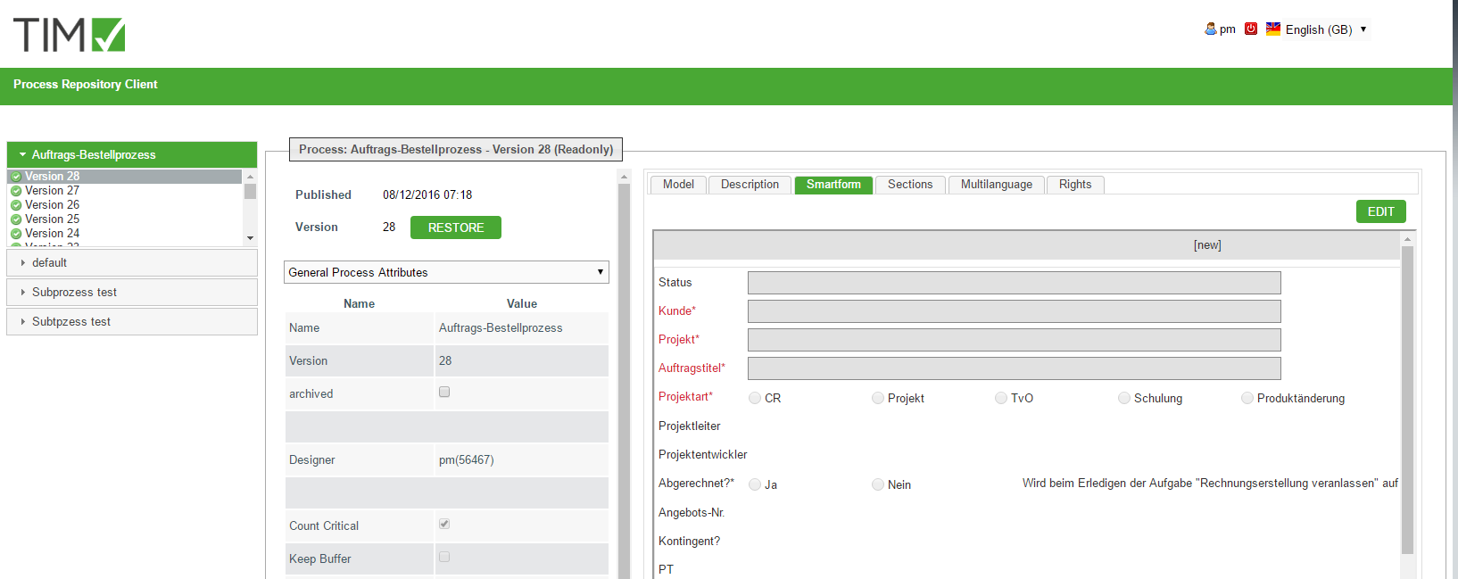
The access to the configurator of the TSS happens via TIM Repository. In the Tab “Smartform” you can find an “EDIT”-Button. The configurator will be opened in a seperate tab upon clicking it.
2.3 Systemroles for the maintenance of TSS resources
Every data-artifact wich is used for the creation of a smartform is saved in a central database. An UI is integrated for the management of the artifacts was integrated in the admin client. A user needs the following role to manage the tss-recources (z.B- confiuratins, CSV-documents, CSS-documents etc. Maintenance of TSS-Resourcen in his client or super- client:
- „resource-manager“ (If a user is a “resource-manager he doesn't necessarily need the role “admin”)
2.3.1 Global ressources in the super- client
After the installation/update of the TSS the basic configurations (documenttype CONFIG-document) for the applications CMD and CFG have to be uploaded in the super- client.
- The configurations dor ACM, TIM-portal and TIM-smartform are included in the product, but can be individualized.
- With the document-type CSS you can provide a CSS-document in order to implement your corporate identity (Colors, accent etc.) globally for the configurator(CFG) and the representation of the smartform (TIM Smartform)
- The document will be automatically renamed into css.css upon uploading.
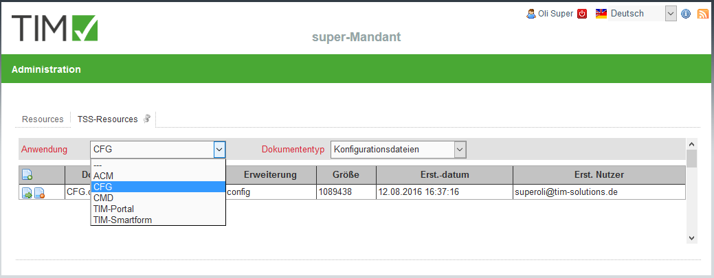
- With the document-type Logo-Datei you can upload a PNG-Document with your corporate logo, wich will be automatically renamed into logo.png upon uploading and will be displayed in the top-left corner of the configurator.
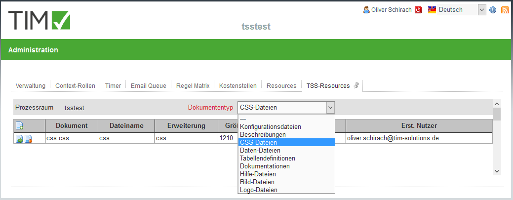
2.3.2 Client-specific resources
It is possible to have artifacts in your client, wich are only available and effective in your client.
- For example a CSS-document wich implements your corporate CI
- Documents with the types .csv, .txt, .xls, .png etc for integration in smartforms
3. TIM Smartform Designer
3.1 Target group & project-scope
- Proffesional users who want to creaete a simple smartform
- Predefined templates
- Intentionally limited choice of possible data-types.
- Creation and arrangement of attributes
- Only simple Smartform, which means without tab-pages, tables or accordions etc. Nur einfache Smartforms, d.h. ohne Tabpages, Tabellen, Accordions, etc.
- For more complex smartforms you have to use the other versions: TIM Smartform Architect and TIM Smartform Expert.
3.2 Explanation of the UI and function - target group professional users!
3.2.1 UI and operationg philosophy
The smartform designer focuses on the smartform.
- It is based on a template and provides the opportunity to arrange atributes per drag and drop.
- With this function you can design you smartform compatible with your process.
- The TSS enables you to use a uniform operating philosophy in your smartforms.
- Because of the uniform structures of the arrangements of attribute, validations, and mandatory fields and editability etc. your end-users will quickly understand all your processes.
- With the button Import activities you can import the activities of your modeled process
- With the Import and Export button you can import configurations or export them as a backup or for further usage in other processes.
- With the Validate button you can validate your configuration.
- With the Test button you can test your smartform from user-perspective:(For further details see 3.2.3 Testmode)
- With the button Deploy you can safe your configurations. Everything you change must be safed by pressing the Deploy button, afterwards it can be seen in the ToDo client.
- If you refresh your browser without pressing the Deploy button your changes will be lost.
- Before/after doing big changes it is strongly recommended to safe your changes by pressing Deploy
- The changes on your smartform will be effective for the value ”—“ in the status-dropdown. In symbolizes the basic configuartion.
- In the chapter 3.2.4 Statusspecified configuration - Import activities it will be explained, how you can individualize your smartform for specific activities in the process.
- Attributes can be placed in any order, moved to another element or be hidden for a specific status via drag and drop
- For further details: 3.2.2 Attributes
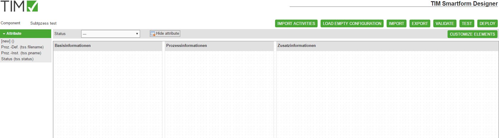
3.2.2 Attributes
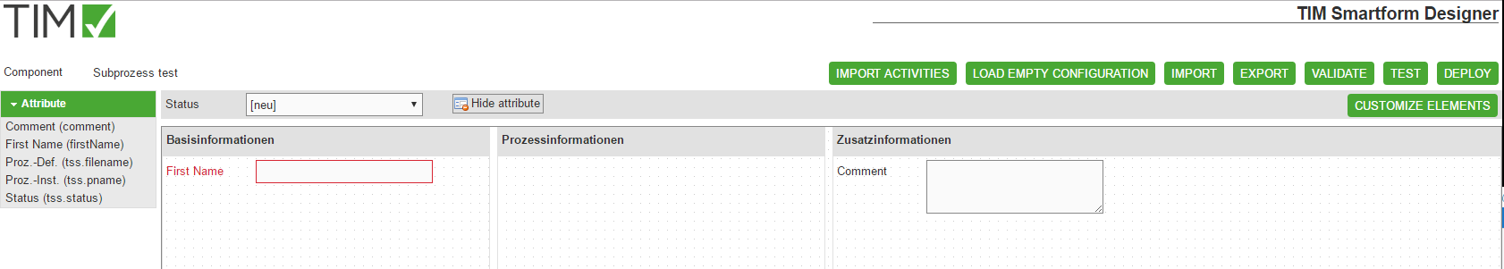
In the smartform Designer you can create attributes to gather and display process information.
- A new attribute can be created by drag&dropping the [new] () tag into the smartfom.
- This is only possible if the status-dropdown is set to ”—“. (For further details to status-specified configurations see also Statusspecified configuration - Import activities)
- A new attribute will be safed as a TIM-process-variable.
- For futher usage (e.g. in Word templates or Emails etc.) the attributes can be found in the process with ${name_of_the_attribute}
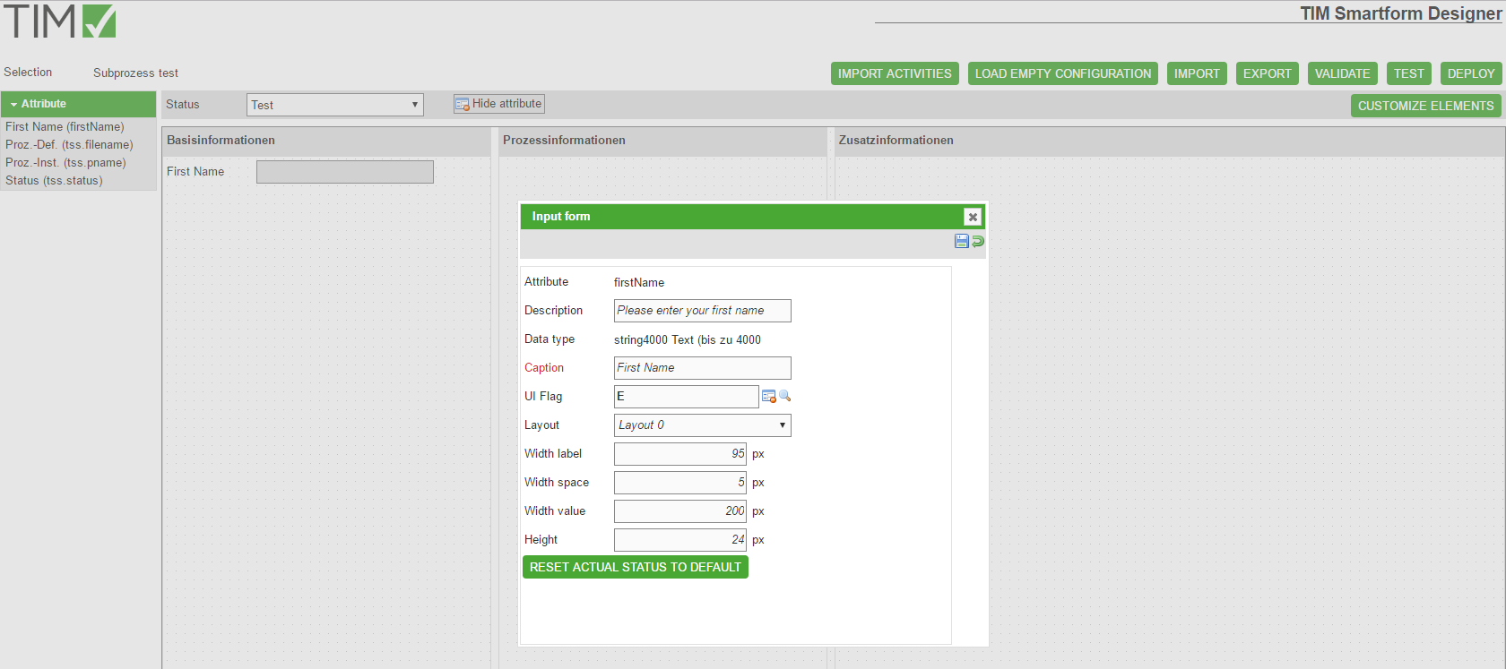
- If a new attribute is dragged into the smartform or if an existing attribute is clicked, a pop-up will appear. There you can change the properties of the attribute:
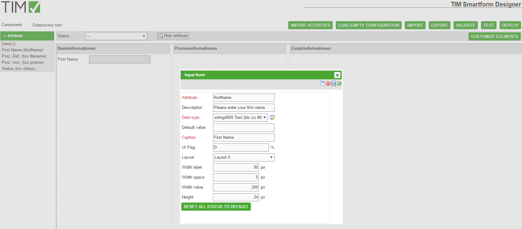
| Field | Description |
|---|---|
| Attribute | Identifier of the attribute. Can be referenced with ${…} in emails. (“status” and “name” mustn't be used as attribute-identifier) |
| Decription | Appears as a tooltip as soon as the user places his mouse on the attribute |
| Data-Type | You can select a data-type or create an individual validation (see also Data-Types) |
| Caption | Will be displayed as text in the left side of the attribute |
| UI-Flag | Definition of the editability of the attribute |
| Layout | Selection of a layout for the display of the attribute. (see also Data-Types) |
| Width label | Width of the space where the desctription will appear |
| Width space | Distance between description and attribute |
| Width value | Width of the attribute |
| Height | Height of the attribute. Every height that is bigger than 24px will be displayed with the layout-option “big” (see also Data-Types) |
| Button | Description |
|---|---|
| Reset all status to default | This button will appear, if the status-dropdown is set to ”—“. It will reset every status-specified versions of the attribute. |
| Reset actual status to default | This button will appear if the status-dropdown is set to something different then ”—“. By pressing it you will reset the configurations of this attribute for the selected status. |
| “Reset a selected attribute-property”-Icon | Every attribute-property that differs from the default-configuration will be desplayed in a bold text. Moreover a button will appear, that will reset the property upon pushing |
| Copy-Icon | Uses the attribute for the creation of a new one. The properties Attribute and Label will be reseted. |
| Delete-Icon | Deletes the attribute. This icon only appears while the status-dropdown is set to ”—“. If you want to hide an attribute, drag&drop it onto the Hide attribute area near the status-dropdown. The attribute will be hidden for the selected status but is still available in the attribute-list in the left side of the screen |
| Save-Icon | Saves the changes/new attribute |
| Reset-Icon | Sets all attributes to the last saved value |
Reference: For further details see also Statusspecified configuration - Import activities
- Every new or changed attribute must be safed by clicking on the save-icon.
- Afterwards the pop-up can be closed and the new/changed attribute will appear on the smartform.
- Every attribute can be moved inside one element or to another per drag&drop.
- If you want to hide an attribute, drag&drop it onto the Hide attribute area near the status-dropdown. The attribute will be hidden for the selected status. See also the screenshots in Statusspecified configuration - Import activities
- The attribute will be still saved in the coniguration, but invisible for the selected status.
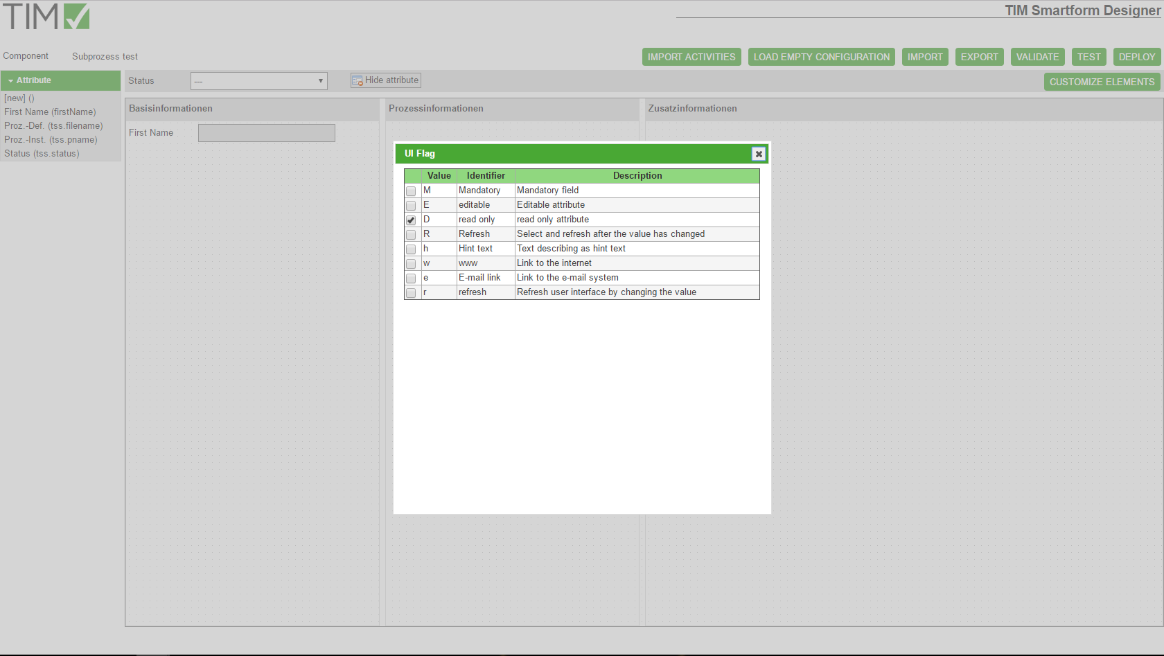
The Ui-Flags define the editability and can be found in the attribute Pop-up. You can either select them fromm a list wich pops up after ckicking on the magnifying glass or write them in the text field:
3.2.3 Testmode
After clicking on the Test-button the smartform will appear like it would look in the current status. Now you can check if the attributes are editable and visible like they should be.
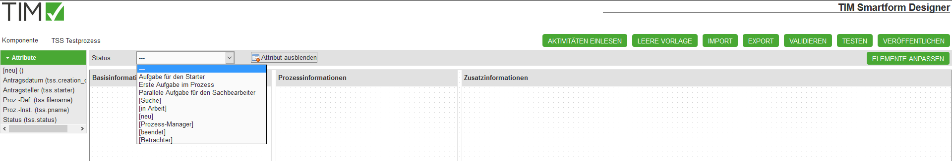
3.2.4 Statusspecified configuration - Import activities
After you have constructed a smartform for the ”—“-status you can now define special process-cases. You need to click the IMPORT ACTIVITIES -button.The status-dropdown will be filled with your process activities.
- Now you can select an activity or a standart status [neu, Suche, in Arbeit, Prozess-Manager, beendet, Betrachter] and change your smartform as you wish:
- Insert attributes
- Relocate or hide attributes
- Modify attribute properties by clicking on an attribute. See also 3.2.2 Attribute
* You can for example make a certain field a mandatory field for an activity.
Attention: If you want to create an attribute just for one status, you have to create it for the status ”—“ first, then drag it onto Hide attribute. Afterwards you have to select the status you want this specific attribute to be visible in and then drag&drop the attribute from the attribute list on the left side of the screen. WILLBECHANGED
- in the attribute pop-up the status-specified configurations will be displayed bold. Configurations that are inherited from the ”—“ - status will be displayed cursive
- Specification of the configurations of the smartform that was created above for the status [neu], which is active while the process is started.
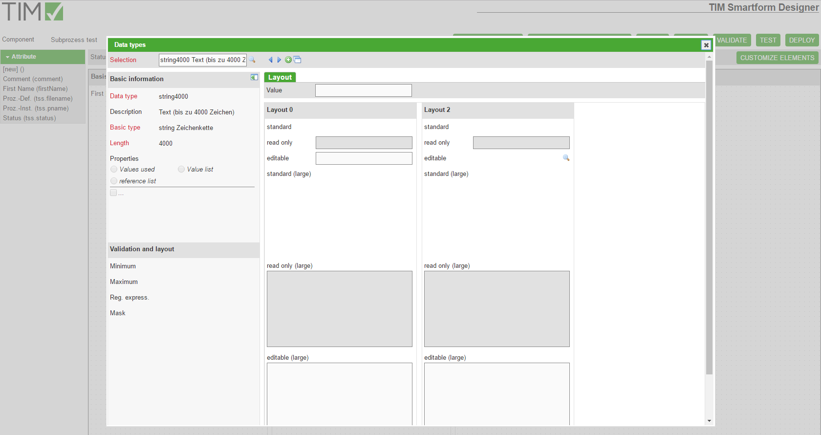
3.2.5 Data-Types
In the attributee pop-up yoiu can find a list of predefined data-types:
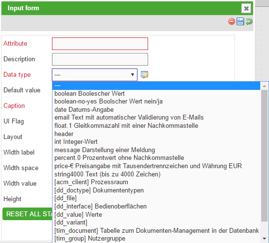
- While using the Smartform designer you will be limited to the following list of data-types.
| Data-type | Description | Example for usage |
|---|---|---|
| boolean | Booleschean Value | Can be used as a check box |
| decision-no-yes | Boolscher Value Yes/No | As a radio box with the options Yes/No |
| date | Date | Can be used as a textbox with a date-picker |
| Text box that automatically validates Email-adresses | As a textbox | |
| float.2 | A number that is rounded to two decimal places | A text-field, wich will try to parse any input to a number with two decimal places and won't accept any other input |
| int | A whole number | A text-field that will try to parse any input to a whole number and won't accept any other input |
| message | Displays a message | To display a legend |
| percent.0 | Percentage without decimal places | As a text field with the unit % |
| price-€ | Pricing with thousends seperator and EUR as currency | A textfield with the unit EUR and validation of numbers with up tp two decimal places |
| string4000 | A character string up to 4000 characters | As a textfield or box |
- If you click the symbol on the right side of the datatype-dropdown list in the attribute-popup you can look through different layouts:
- You can also create an own data-type in the Data-type-popup by clicking the green PLUS-Icon
- This data-types are based on existing data-types
- By creating length-limitations or input-masks you can create a validation. This can be used to create a field that validates input to fit a certain structure, for example an accounting area XX_098_XX.
- For further details to the creation of new data-types see 6.4 Module Datatypes
- Coplex data-tyoes, like CSV-Lists for autocomletes or Dropdowns can be created in the TIM Smartform Architect
- Created data-types will appear in the data-type dropdown-list in the attribute pop-up and can be also used in the designer.
Some comlex data-types can be created in the Designer:
- Radio-Buttons with more than two options:
You have to create a new data-type, like descriped above: You will have to select the basic-type “String” and “Value List” as Property. The “Length” defines the maximum numbver of characters that can be used in the Label of each button. After saving (click floppy disk) two tabs will appear: “Values” and “Layout”. In the tab “Values” you can create the radio-buttons. The property “Value” will define the value which the radio button will return upon being selected. Now you have to save the attribute and close the pop-up. In the remaining pop-up you have to select “Layout 3” and set the “Height” to >= 25 pixel.
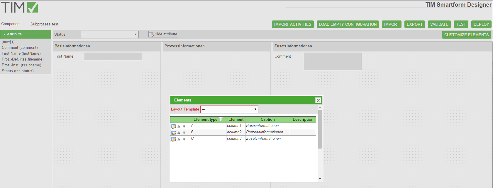
3.2.6 Templates
The basis of a smartform is the template. Upon creating a new smartform, the 3columns-template will be selected. If you need a special template you have to create it by using the Smartform-Architect or -Expert. A user with the right smartform-architect or smartform-expert can create a unique template. Attention: The Smartform Architect is for professional users. Because of that it is impossible to create complex layouts with tabs or dummies for the display of tables with the designer.
- By clicking on CUSTOMIZE ELEMENTS you can change the headline of the selected template element:
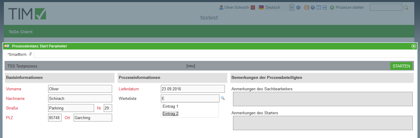
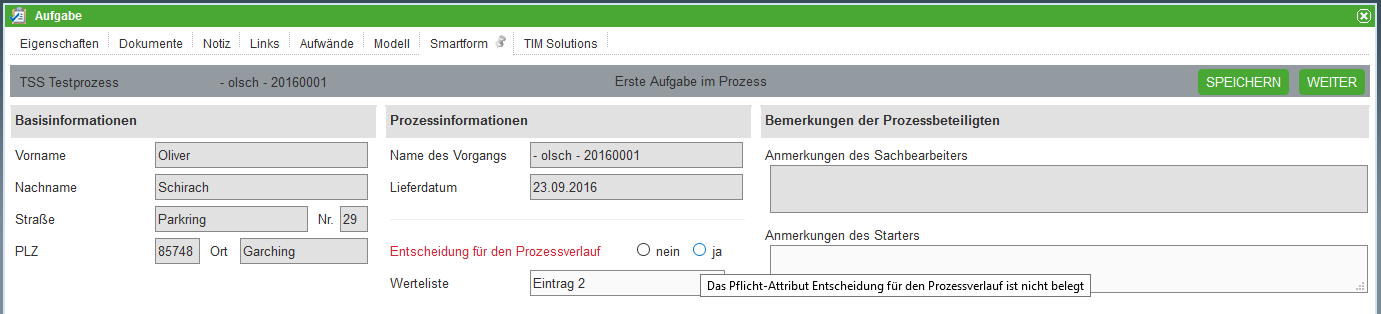
3.2.7 Ergebnis im ToDo Client
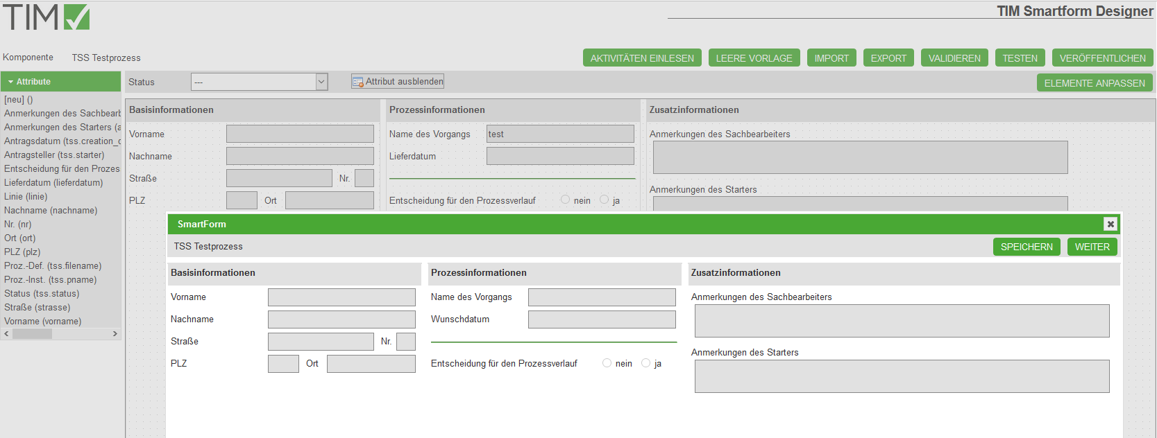
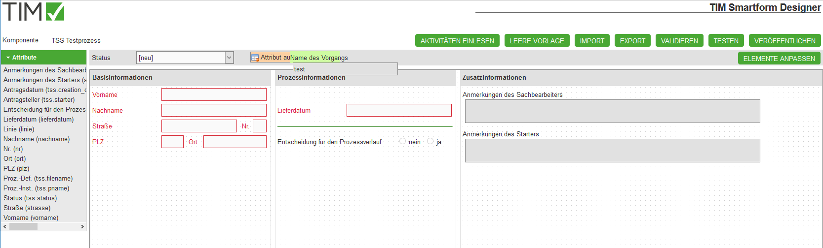
The following screenshot shows a configured smartform at the beginning of the process and for the first task. You can see that some attributes are hidden and others are coloured red:
- Smartform at the beginning of a process “TSS Testprozess”:
- Smartform for the first task “Erste Aufgabe im Prozess” of the process “TSS Testprozess”:
3.2.8 Configurations for testing
The configurations used for the process above can be found here: Example configurations
4. TIM Smartform Architect
4.1 Targetgroup & projectscope
- IT consultants
- Creation of complex smartforms with data-structures, tabs etc.
- Integration of structured data from csv, txt xls oder database-tables
- Creation of translations for multi-language smartforms
- Creation of data-types, templates and messages for a process
- Easy excess to Groovy for showInterface in order to modify the user interface.
- ANYTHING that is defined for a process. E.g. Templates, data-types etc. only exists for the process where it was created
4.2 Explanation of the UI and functions
- TODO Overview: Menu; Sidebar; WYSIWYG
- For further details see 6. Module des TIM Smartform Architect und Expert
5. TIM Smartform Expert
5.1 Targetgroup & projectscope
- IT consultants and developers
- Deep system integration
- Complex configuration-possibility
- Groovy extended. CBAGenericActionHandler can be used in the process
- ANYTHING that is defined for a process. E.g. Templates, data-types etc. only exists for the process where it was created
5.2 Explanation of the UI and functions
- Overview: Menu, Sidebar; WYSIWYG
- For further details ss 6. Modules of the TIM Smartform Architect und Expert
6. Modules of the TIM Smartform Architect und Expert
6.1 Module UI
- Creation of new templates:
You need architect- or expert-rights. Click on the tab “Templates” in the top left corner, then on the green “PLUS-Icon”. Name your template by entering something in the field “Template” and save everything (by clicking on the floppy disk). Afterwards click the tab “Elements” and then the green “PLUS-icon” on the top right corner. Name your element. (This is not the only correct way but a step by step tutorial on how to create a blank element with a certain size) Select position 1 if you havent placed any other elements into your smartform. Select “A-Element” as the “Element type” and “uie-details formular element” as “UIE”. In the section “positioning you can select the size and the gap between this and other elements. To finalize this creation click SAVE and DEPLOY.
6.2 Module templates
6.3 Module tables
- The dau specifies the storage medium (e.g. files or database)
- Bei Ablage als Prozessvariable (BL-Flag P) immer dau-tim verwenden. Achtung: Max. 4000 Zeichen in einer Prozessvariable erlaubt. Dies schließt Steuerzeichen der Tabelle mit ein. Bitte nur zum fixen Testen verwenden
6.4 Module Datatypes
List of all basic types and further details
Regular expressions
- Represent patterns of valid strings.
- If there is a pattern for the regular expression, then teh attribute value is only allowed if it is simular to the pattern.
- The sytax of regular expressions is not easy, please use literature e.g.: http://www.regular-expressions.info/quickstart.html.
Masks
- Only allow input with a certain pattern:
- 0 .. algebraic signs and numbers
- 9 .. only nummbers
- a .. Letters (A-Z,a-z) and ‘-’ and ‘_’
- z .. only letters (A-Z,a-z)
- * .. letters (A-Z,a-z) ,numbers, ‘-’ and ‘_
6.5 Module massage
6.6 Module translation
6.7 Module functional structure
6.8 Maintenance of TSS-Resourcen
7. Usefull tipps for the most common smartform applications
7.1 Display attributes in the taskbar
- Attributes that are visible in the taskbar are called Indexfields
- There are 10 fields wich can display any attribute
- Modul tables - select tim_process - Tab Attribute - select Attribut - In the right sidebar you have to select the BL-Flag 1 or 2 … or 0 - save - Deploy - Start a real process for testing
- The headlines for each index can be changed in the custom.js like this for every vlient:
- gadget.languages.de.standard_smartformindex1= 'Überschrift für Index 1 in DE';
- gadget.languages.en.standard_smartformindex2= 'Überschrift für Index 1 in EN';
7.2 Special properties of attributes
- Additional flags for “E” or “D” :
- Mail (e): A button will appear on the right side of the input field. If clicked, the default Email massenger will be opened. The email adress will be auto-filled.
- HTML-Hyperlink (w): A button will appear on the right side of the input field. If clicked the default browser will be opened and the entered adress will be opened.
- Additional flags for “E”:
- Placeholder (h): The entered text will additionally be displayed in the background of the textfield
- refresh (r ): After enterign something in the field, the smartform will be refreshed. The Groovy method showInterface will be executed again. Functions wich are stored there cna now modify the smartorm, e.g. change the visibility of of attributes etc.
- If this flags ar ecombined with the flag “D” or aren't combined with the flag “E” they won't have any impact.
- Break of the label-width and field-width:
- Normally an attribute will be displayed like this: Label + gap + field
- If the field should appear under the label, then the label-width has to be bigger than usual. If the label-width + gap-width + value-width are bigger than the element they are placed in the input field will be placed under the label.
7.3 Import a csv-document for an autocomplete-/dropdownfield
- First you have to create a module wich is named like the csv, txt or xls file
- The table must get the matching DAU
- The BLU must be set to “blu-basic”
- Now you have to create an attribute for every column
- The usage is correspondent to the smartform-fields
- Important: DA-flag must be set to “SIU”
- Index: Here you have to select wich columns will be used as a unique reference (=index 1) of a data type
- Ref.-type:
- Here you select wich attribute will be used as a discription, for example in a drop. This is selected with “D”
- Here you select wich attribute will be used as short identifier. This is selected with “I”
- Here you select wich attribute will be used if a selected entry will be saved. This is selected with “V”
- For further details see (Example of a dropdown-option in HTML: <option value=“Attribut mit V”>“Attribut mit I” “Attribut mit D”</option>)
- Now the file has to be reuploaded in the resource tab in the admin-client. Select the datatype “filefile”
- After the upload press the button “Delete Cache”
- Data-type for Dropdown
- For the table to be used as a basis for a dropdown or an autocomplete field a data-type must be created
- Baic-type: = Data-type of the column of the CSV which is used as the unique reference
- Properties: Reference list
- Table: a priviously created table
- Attribute: The attribute from the table which should be saved in the database. It has to be unique. Matches the attribute with “V”
- Filter: optional - here you can limit the number of results to one attribute. Use this syntax: ATTRIBUT= . By using ATTRIBUT={ATTRIBUT_IN_TIM_PROCESS} you can search the content of another attribute. IMPORTANT: The attribute wich is searched has to have te “r”-flag, so if the value is changed the table will be loaded with the new filter.
- Display:
- Leave empty, then the default will be applied:I and D
- or select attributes with {Attribut}, that should be displayed e.g.: {nachname}, {vorname} results in: “Schirach, Oliver”
- Alternativly a table can be used as a grid to display data sets in a table
7.4 Creation of tabpages
- An element with the uie-tabpages-interfaces must be included into the smartform
- If the first tab should load immediatly you have slect the Flag “t”
- Now you have to create a template for each tab
- Attention: Please avoid same element-letter, because then attributes would appear in every tab with the same letter
- If overlapping letters cannot be avoided then attributes must not be placed by drag&drop
- The attributes then have to be placed via user interface - attribute assigned in the table to the selected letters. Make sure the selected tab is the one you want to place the attribute on. If an element-letter is entered in the table then the attribute will only appear on the selevted tab.
- In order to combine the tab with the element in the smartform, the entry ”[new] ()” has to be drag&dropped from the accordion (content) onto the element with the uie-tabpages-interface
- An empty sidebar will appear, where the added Tab will be configured:
- User interface: technical name for the tab
- Description: label for the tab
- superordinate: Smartform
- Template: The template for the tab
- Menu / content: Select the element with the uie-tabpages-interfaces
- UIU: If the tab contains processvariables that are saved in tim_process, then: uiu-selection
- Wenn das Tab auf eine Tabelle zeigt, die mit dem Prozess in Verbindung steht, dann uiu-details
- Properties: E, so the tab is editable
- additionally n and a, if the tab uses a table and the attribute are arranged in the tab. If you use a grid, don't use n and a
- Icons: Not necessary. They are used if you use a grid to display data-sets
- Table: tim_process, if only process varables should be displayed
- Filter: Limitation of table to certain entries. YOu can desplay information that is filtered by one or more attributes
7.5 Integration of a table as a grid
- Attention: Used template grid - template in the user interface section - Elements - G - set to uie-grid-edit or the icons won't be visible
7.6 Creation of an accordion
- Subelements
7.7 Creation of a Groovy code, wich will be executed upon loading the smartform
- In the module user interface there is a sidebar with the button “showInterface” for every interface
- There you can save Groovy code which will be executed as soon as the site will be loaded
- With the flag r you can reload a page after a value is entered.
- The interface will be reloaded and showInterface will be executed again
- All dynamic filters in data-types or tables that access other attributes will be executed again too
- Incoming data will be preserved
- Examples:
- Pick out the user language and set it into the attribute “language”:
      def locale = FRAME.getProperty("locale_id").toUpperCase();
      if (locale != null && locale.length() > 1 && locale.substring(0,2) != "DE") {
         DATA_ROW.setValue("mm_sprache","EN");
      }
- Set a UI-Flags for an attribut:
      ICbaRow attribut_xxxx = FRAME.searchRow("dd_intattr", "interf_recid=" + CONFIG_ROW.getRecid() + "&attr_id=TECHNISCHER_ATTRIBUTNAME");
      attribut_xxxx.setValue("ui_flag", "D");
- Read the value for an attribute:
String wert_des_attributs_im_moment_des_seitenaufbaus = DATA_ROW.getValue("TECHNISCHER_ATTRIBUTNAME");
- Set a value for an attribute:
DATA_ROW.setValue("TECHNISCHER_ATTRIBUTNAME", "neuer_Wert_für_das_Attribut");
7.8 Configuration of status-specified attribute-properties
- Reset variants of an attribute to standart
- „Reset for every status“ bzw. „Reset“ buttons
- Statusoverview. Copy , delete , * Step that has been omitted *
8. Installation
- see also Installation
9. Old CBA Wiki
